●「モルキの自由帳」とタンスギミックを作った8月
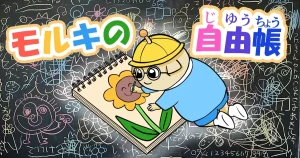
モルキのメモカードはテキストによる活動報告ですので、その画像版があったらいいな~と思い、「モルキの自由帳」を作って8月に公開しました。モルキのメモカードで作った紙をめくるシステムを応用しました。サイトに来て下さった方々に、「こんな風にコンテンツを作りました」と紹介するバックヤード的なコンテンツです。コンテンツ制作の苦労や試行錯誤をありのままに見せることで、サイトやコンテンツに愛着を持っていただけたら嬉しいです。
多くのサイトは、完成品を表示して未完成の状態がどういう状態だったのかを知ることがあまりありませんが、フカボリカラーズでは未完成の状態を公開して、少しずつコンテンツが完成していくプロセスそのものを楽しんでほしいと思います。モルダモルキが「ゼロ」から何かを作り出すことをエンタメにしたいです。
次はどんな変なものを作るのか、ぜひ楽しみにしてください😆、どんどん変なサイトにしていこうと思います(笑)
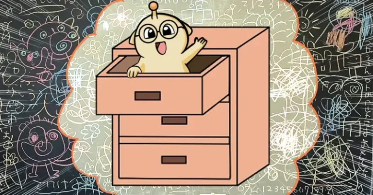
変と言えば、トップページに「タンス」を設置しました。これは「モルキの自由帳」へのリンクです。タンスの中からクリエイターの自由帳が出てくるというイメージで設置しました。こういう自作のリンクはなかなか他のサイトにはないと思いますので、フカボリカラーズらしいコンテンツになったと思っています(笑)
実はこのタンスを作るのにけっこう時間がかかりました。当初は3Dのタンスを作ろうと思いましたが、うまくコーディングで描画できず、最終的にクリスタで描いた素材をJavaScriptで動かしてタンスを実際に開いているような演出にしました。この試行錯誤は、モルキの自由帳のメイキング画像で公開していますので、興味のある方はぜひご覧ください♪
文字リンクなら一瞬でできると思いますが、私は「無駄の中に面白さや楽しさが宿る」と思いますので効率化せずに大幅な回り道を選択しました😆👍
キレイに整ったサイトを作ることはもちろん大切ですし、素晴しいことですが、私は少しでも驚きや楽しさを届けたいと思っています。そのための努力ならば惜しみません。「意味のある無駄」と思いたいです(笑)
現在はタイパ・コスパの時代でAI化によってあらゆるものが効率化できる時代だと思いますが、そういう時代だからこそ、作者のこだわりやクセみたいなものがよりいっそう価値が出るのではないかと思っています。
● Creating “Molki's Sketchbook” and the Cabinet Gimmick
“Molki's Memo Cards” are text-based activity reports, so I thought it would be nice to have a visual version of them as well. That idea led me to create “Molki's Sketchbook,” which I launched in August.
I adapted the page-turning system I had created for Molki's Memo Cards. The Sketchbook is like a behind-the-scenes section where I can show visitors to the site how I create my content. I hope that by showing the struggles and trial-and-error involved in creating my content just as they really are, visitors will develop a stronger attachment to the site and its content.
On many websites, you see the finished product, but you rarely get to see what it looked like while it was still unfinished. At FUKABORI COLORS, I want people to enjoy the process itself—the way content gradually takes shape and is completed little by little.
I want the process of creating something from “zero” to become entertainment in itself.
So please look forward to seeing what strange thing I make next! 😆 I’m going to keep making this site stranger and stranger. (Haha.)
Speaking of strange things, I added a “Cabinet” to the top page. It is a link to “Molki's Sketchbook.” I designed it with the idea that the creator's sketchbook would come out from inside the cabinet.
I don't think there are many websites with a handmade link like this, so I think it has become a very FUKABORI COLORS-like piece of content. (Haha.)
Actually, creating this cabinet took quite a lot of time. At first, I wanted to make a 3D cabinet, but I couldn't get it to render properly with code. In the end, I drew the cabinet materials in Clip Studio and used JavaScript to create an effect that makes it look as if the cabinet is actually opening.
I have published images showing this trial-and-error process in “Molki's Sketchbook,” so please take a look if you're interested♪
A simple text link could probably have been made in an instant, but I believe that fun and interesting things can sometimes be found in the “unnecessary” parts. So instead of optimizing for efficiency, I chose to take a much longer route. 😆👍
Of course, creating a clean and well-organized website is important, and it is a wonderful thing to do. But I want to deliver even a little bit of surprise and fun to visitors. I don't want to hold back when it comes to making that happen.
I'd like to think of it as “meaningful inefficiency.” (Haha.)
We live in an era of time and cost efficiency. AI makes it possible to optimize all kinds of things.
But precisely because we live in such an era, I believe that an individual creator's personal preferences, quirks, and attention to detail may become even more valuable.